 YouTube started rolling out its anticipated redesign on Wednesday, with the goal of cleaning up its “bloated” interface while retaining users who are used to the clutter of the “cockpit.”
The company unveiled the official redesign at a blogger breakfast in San Bruno, California. CNET was there:
YouTube UI designer Julian Frumar explained that the site was simply not working like it should with the addition of extra features over the years. There were too many things on the screen that were slowing down page views and overwhelming people. In other words, YouTube was getting bloated. The other part of the problem was that YouTube had two distinct groups of users. Those who wanted a simple, video-centric experience, versus those who wanted the "airplane cockpit" of links, buttons, and knobs. The new look is an attempt to satisfy both groups, while tweaking the overall look to make the pages less overwhelming to newbies.
Also, curiously, YouTube has decided to do away with the five-star ratings system, opting instead for thumbs-up, thumbs-down model – a change that is certain to annoy “power users.”
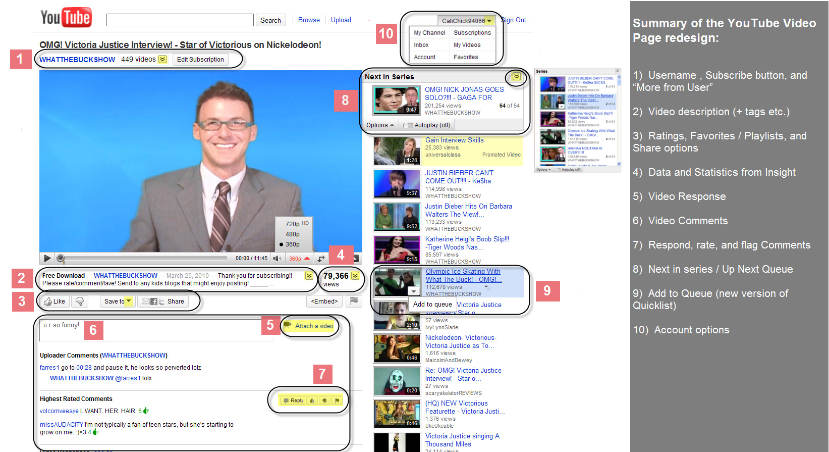
Here’s a “cheat sheet” screengrab of a resdesigned video page, provided by YouTube (click to enlarge):
Now, I’m not a newbie, nor would I qualify as a “power” YouTube user. But the redesign doesn’t appear to strip away too much of the clutter I saw in previous iterations. Just reorganizes it a bit.
Clutter, you see, is sorta helpful in achieving YouTube’s bigger goal: options to view similar videos that ultimately keep people on the site – currently for an average of 15 minutes a day.