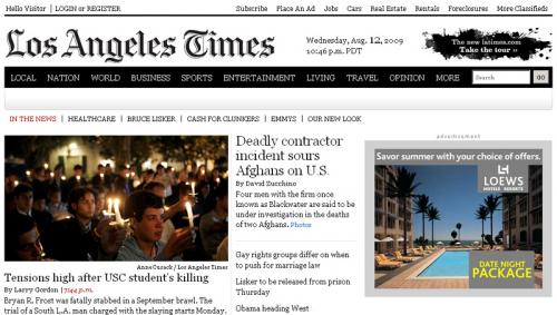
Some of its top editors may be getting poached by web-only players, but the Los Angeles Times finally has a flashy site worthy of its Hollywood home.
The LATimes.com unveiled the redesigned site Wednesday with a sleek, clean new design and simpler navigation that includes links to news stories above the fold.
“We now have the flexibility the day’s big stories in more dynamic ways,” a note from the Times said.
Meredith Artley, the paper’s online managing editor, called it “a cleaner, crisper, more innovative site.”
The site also includes the interactive bells and whistles — slideshows, video, live newsfeeds — now common among like-minded newspaper sites such as the New York Times. (Although the design seems to have more in common with New York magazine’s award-winning Web site than the Grey Lady’s.)
The site’s “signature” is an image of splattered ink, “rendered in pixels to connect to our proud, 127-year-history.”
“We’ve simplified our articles, making them easier to scroll without interruption from related content or advertising,” Artley wrote in a note to readers. “We’ve enhanced our article-sharing features as well to include more seamless interaction with social-networking sites and the ability to send articles to instant-messaging services and mobile devices.”
The site is also using a larger typeface — a nod, perhaps, to an aging print audience migrating online.
“Design aficionados will note that we have gone from a sans-serif font (Arial) to a serif font (Georgia),” she wrote. “Not only did we find that this was a more readable font, but we also felt it connected to our overall brand much better.”