Since the days of “Game of Thrones,” the title design of high-profile television programs has often fallen back on a familiar approach: objects sliding around the screen, creating a 3D landscape of moving parts.
Some of this year’s Emmy-nominated title sequences take that style and put a spin on it; “Spider-Noir,” for one, captures the idea of shifting layers of movement in a 2D environment using period newsprint, black-and-white photos and lots of shadows.
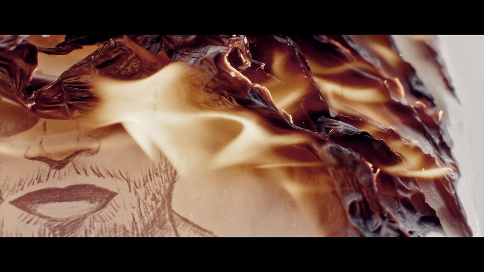
Then there’s “Smoke,” which burns stuff up. Backward.
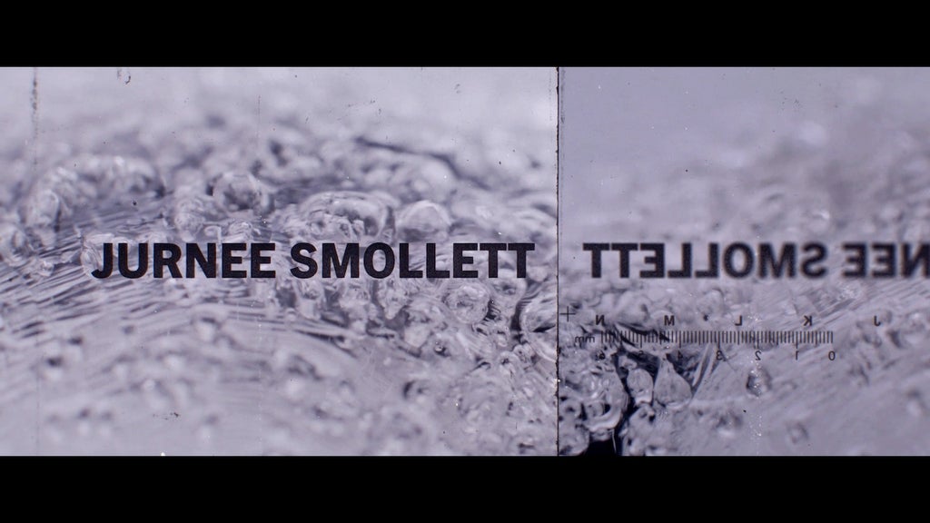
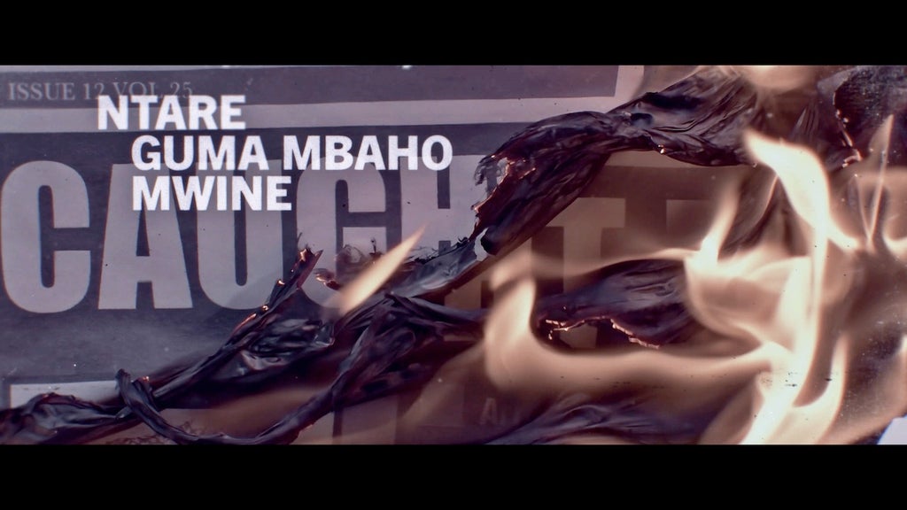
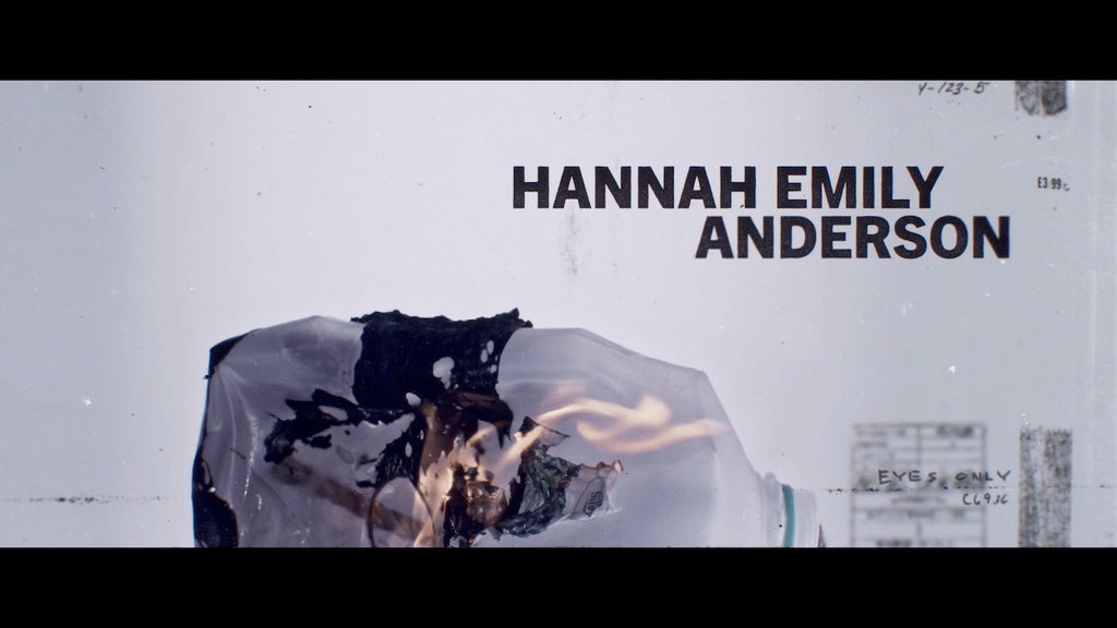
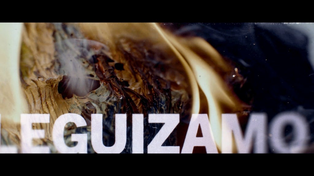
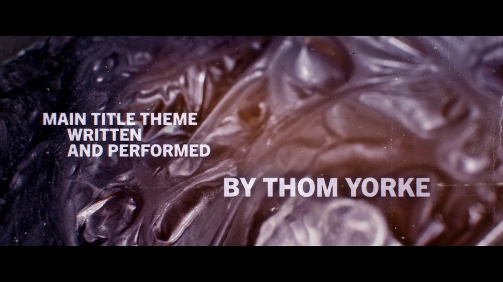
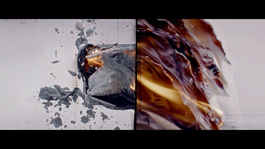
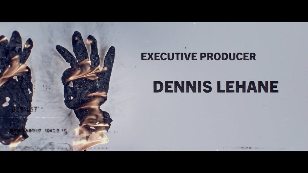
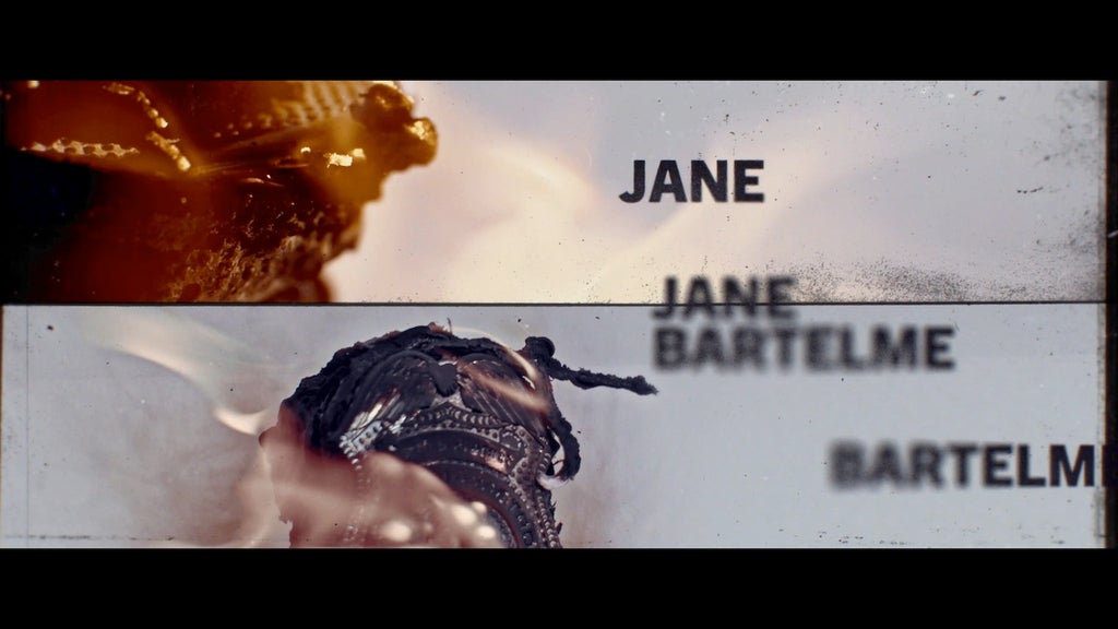
And once the title sequence to the Apple TV series about an investigator stalking an arsonist pops up on screen, you can’t help but see it as the perfect introduction. Footage of burning objects is reversed, causing piles of ash to reconstitute themselves into pieces of paper, gloves, a plastic milk bottle, a pair of sunglasses, a document; Radiohead’s Thom Yorke sings a quiet, hesitant song.

“It’s pretty simple,” said Mason Nicoll, director of Digital Kitchen, the creative studio that produced the sequence (as well as the one for “Spider- Noir”). “But it’s unraveling and uncovering the way an arson investigator brings evidence back.”
The concept for the main titles was one of four that Digital Kitchen pitched to the “Smoke” producers, and the one they quickly focused on. They had rough cuts of a few episodes to watch as they planned the sequence, and they knew that it would be set to a new song by Yorke, a friend of “Smoke” creator Dennis Lehane.
Designer Ana Criado came up with storyboards based on two key ideas: Objects would appear to “unburn,” and they’d reveal details about the show’s story as they became whole again.
“At first, things all look like little briquettes,” Nicoll said. “But then the further into the sequence we get, they start to re-form into their originals.”
The initial plan was to be more literal and clear about what they were revealing — Taron Egerton’s disguise, Jurnee Smollett’s badge — but Lehane and the producers urged them to embrace the mystery. Cinematographer Rachel Brickel conducted extensive tests to determine which items burned best.
“There were very specific details about, like, the brand of potato chip, because the amount of oil determined how they look when they’re burning,” Nicoll said. “Some objects we thought would be amazing just didn’t look great — or they might burn well, but once they’re revealed, you don’t really know what the object is. We burned a hair scrunchie that looked great. It’s made out of polyester, so it burns really cool. But to reveal that as a solo object becomes more confusing.”
The shoot itself took place on a stage outfitted with a huge ventilation system. The Digital Kitchen team also had to take precautions with the surface on which they were burning the objects and shooting them with two cameras, one at a distance and one zooming in tighter.
“We wanted it to look like you were shooting on a light table, that it was part of an investigation process,” Nicoll said. “So we had to study the type of glass that can take those temperatures and not shatter. And even with that, we still shattered a couple, because the temperatures got so, so hot.”
He laughed. “It ended up being a little more work than, ‘Well, we’re going to light it on fire and see what happens.’” In fact, they tried to cut down on the amount of visible flame. “When we see things burn in reverse, it becomes more interesting the less fire you see when these black wrinkled objects start to unfold.” Paper products were a particular wild card, with some requiring flame retardants to keep them from burning too fast.
Postproduction was tricky, as editor Justin West bounced between different objects and worked to convey just enough information while dropping in names and titles in a way that fit with Yorke’s song.
“Once we locked in on the kind of ping-pong of the objects, it became a cadence,” Nicoll said. “With a lot of Radiohead and Thom Yorke songs, he has this really interesting mix of tempo and things that are purposely off tempo. So we started to play off that. And with the type, we wanted it to be simple but also idiosyncratic.” Ultimately, all those decisions and idiosyncrasies just felt right.
“It’s weird,” he said. “After shipping it and after watching it a couple times, it’s like, yeah, it really couldn’t be anything but this. It’s like the classic line ‘There’s thousands of right answers.’ For this one, it was like, ‘No, there’s one right answer.’”
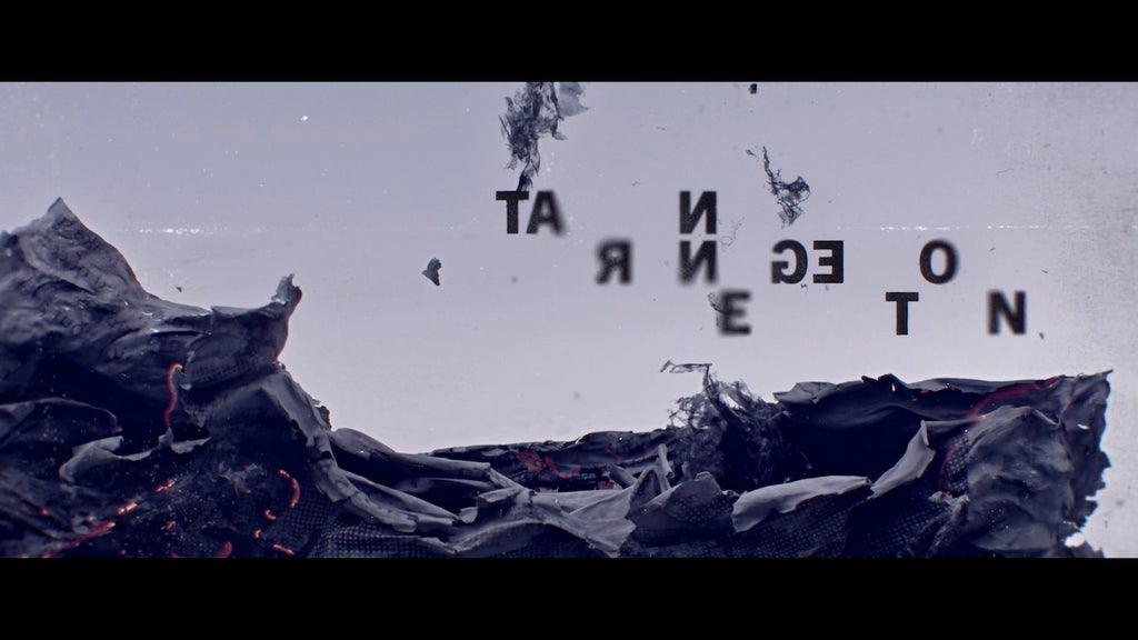
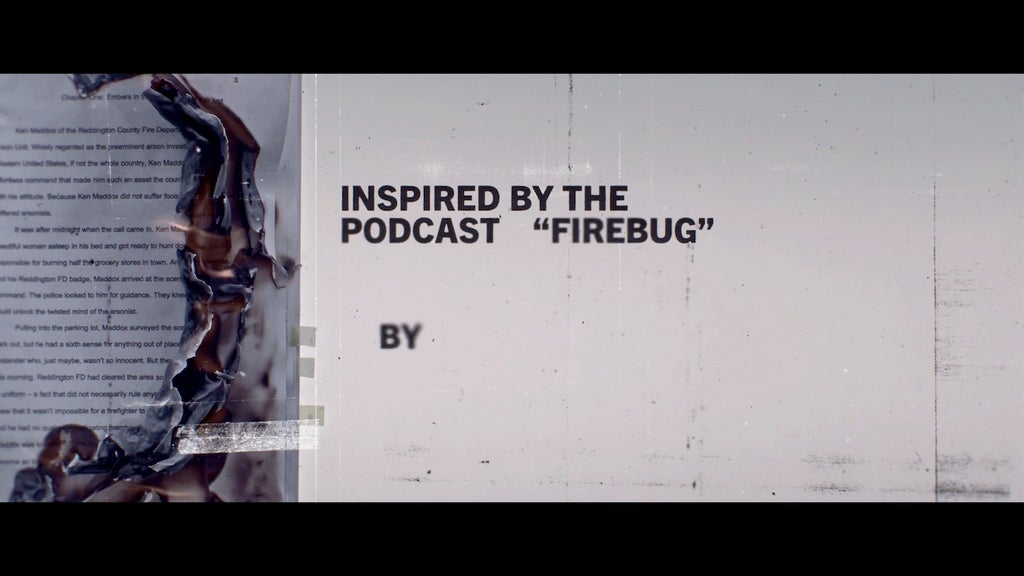
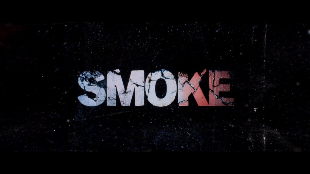
Here, courtesy of Digital Kitchen, are images from the “Smoke” main titles:
This story first appeared in the Down to the Wire: Drama issue of TheWrap’s awards magazine. Read more from the issue here.